Loggly Charts & Dashboards
2016-2018 / Next generation charting and dashboard feature for log and data analysis
Details
Company: Loggly
Worked on: User experience, usability research, interaction, visual, & systems design
In the news
10 Things Learned from Launching a New Product by Pranay Kamat, Sr. Product Manager
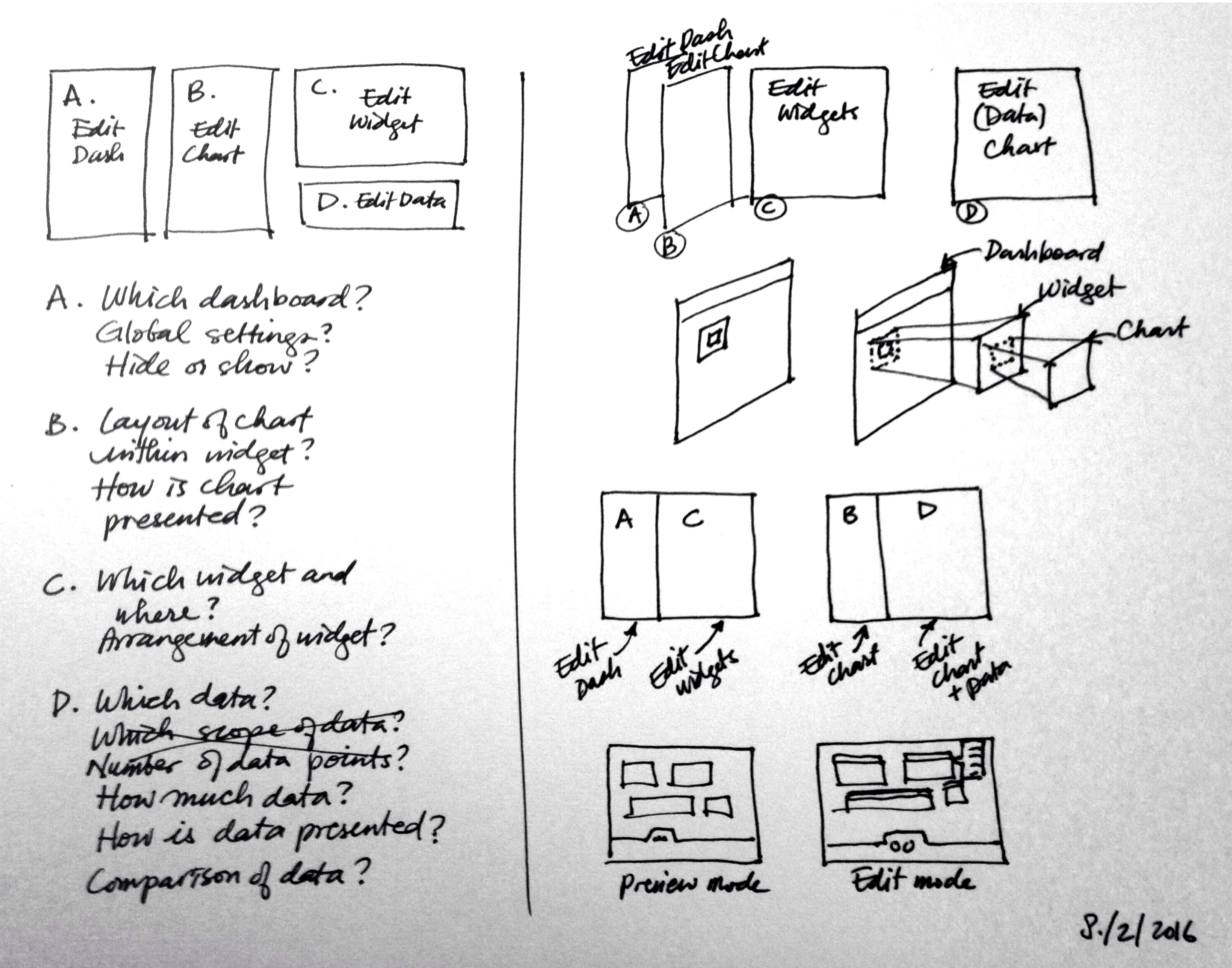
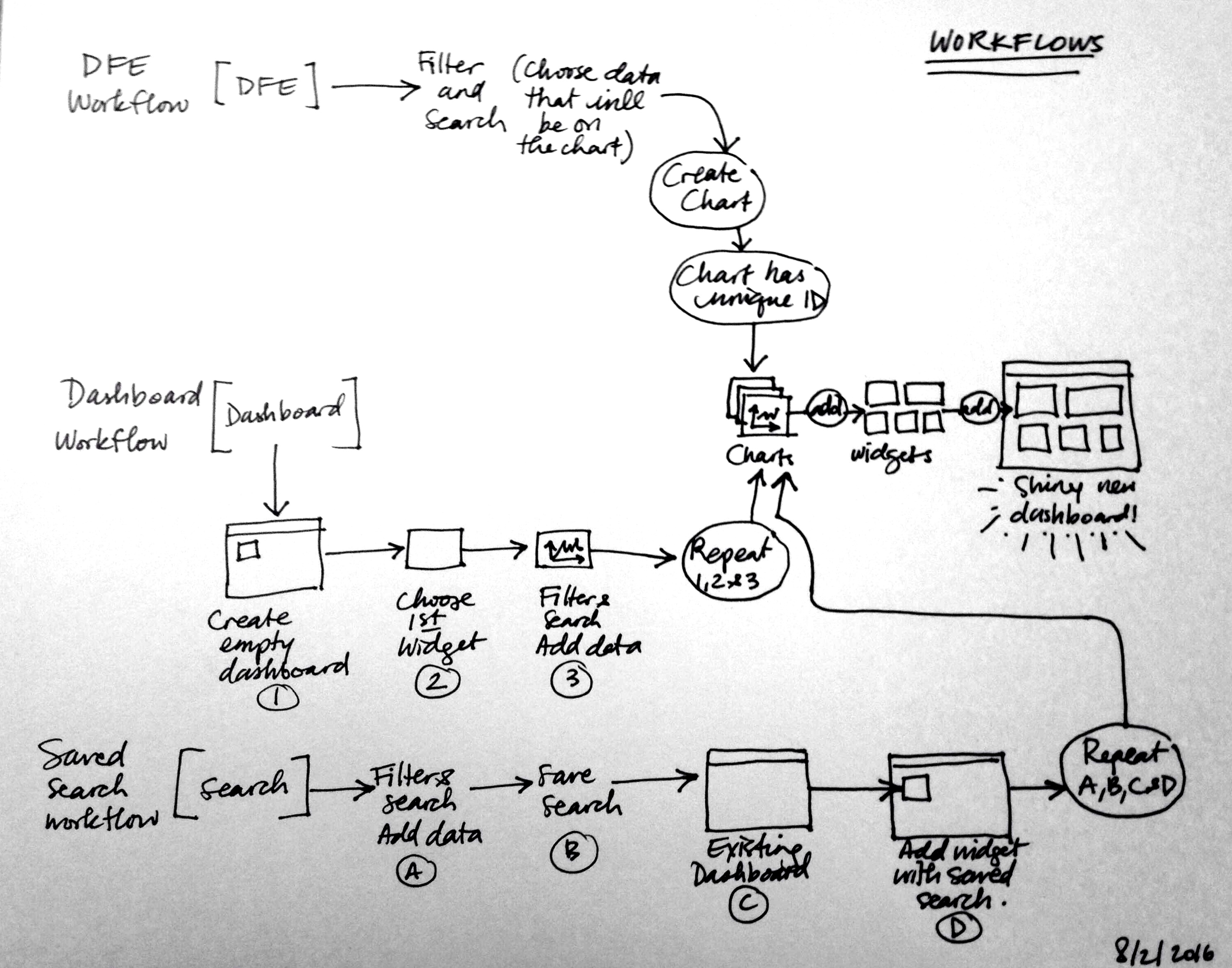
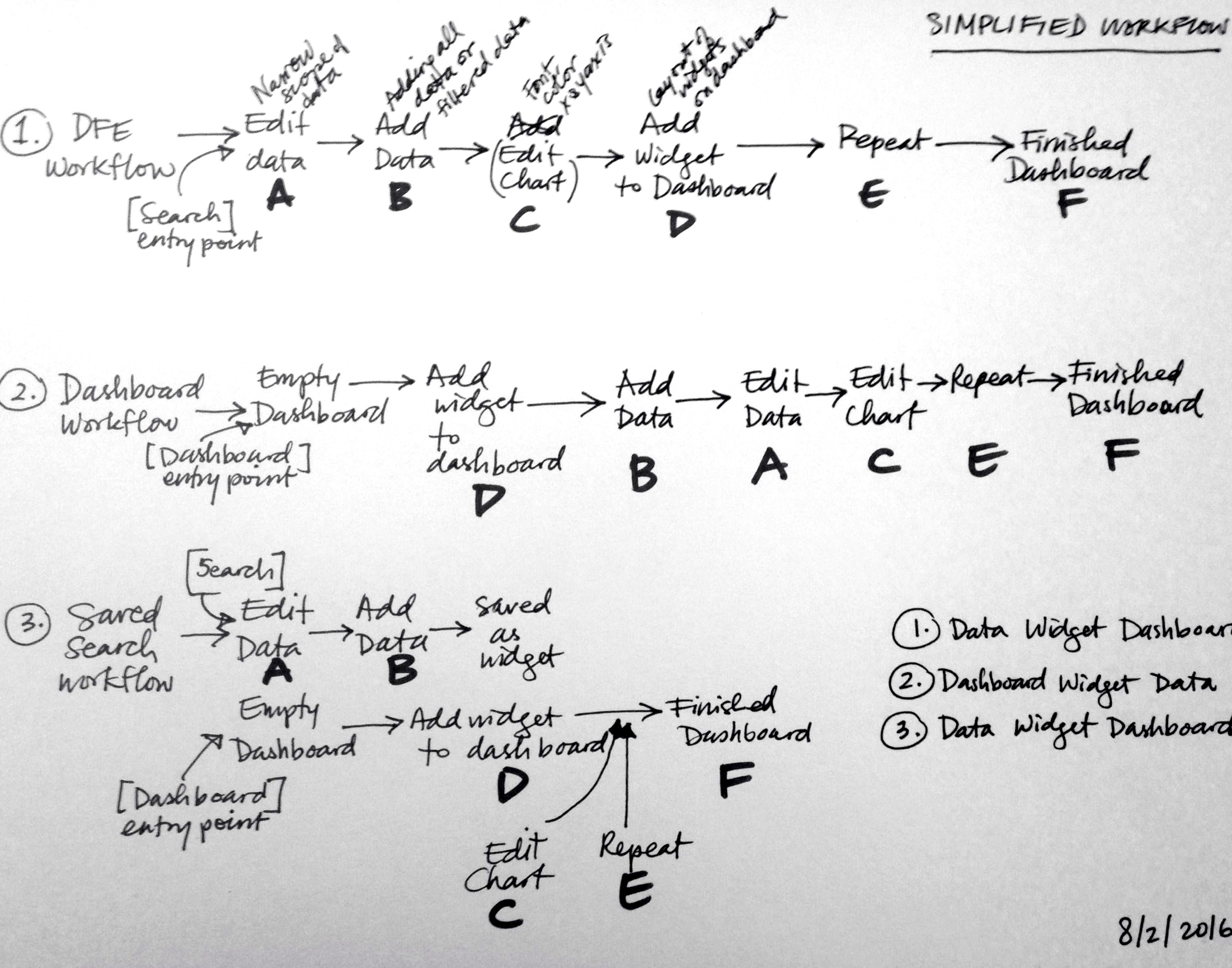
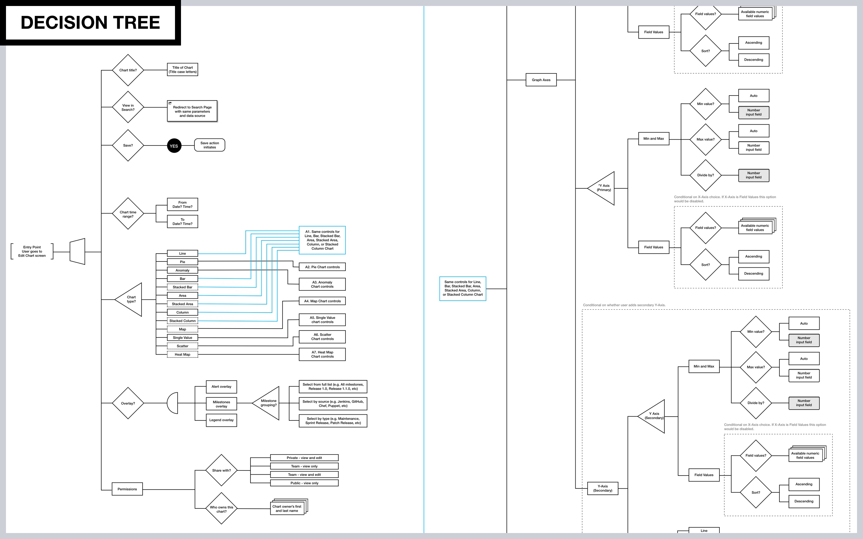
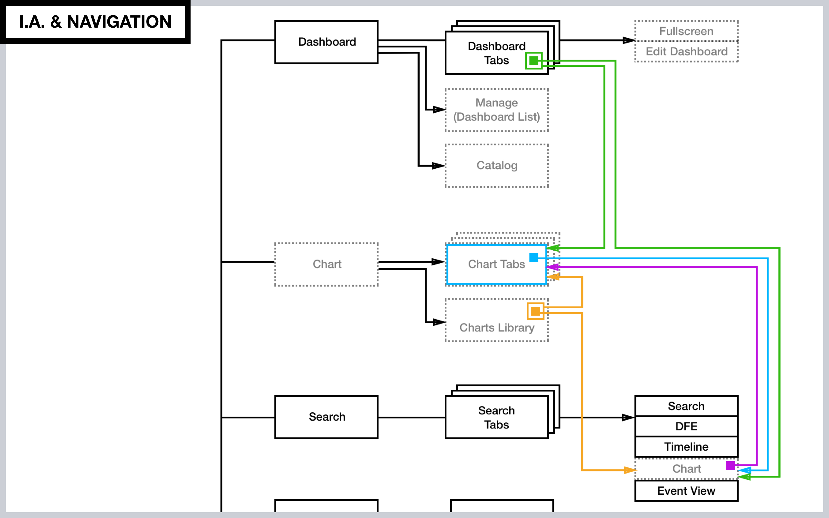
Challenges: Working with and displaying dynamic big data visualization in near realtime, designing the tool as well as its resulting output to accommodate as many common use cases as possible, enabling users to have greater flexibility, getting clear on what the actual most common use cases and workflows are, and designing for optimal user experience. Come up with logical and simple paradigms for how users would interact with dashboards, charts, series, and data and how those elements interact with each other.
Solutions: Designing for the flexibility of the data itself (e.g. lots of data VS sparse data, the ever changing data sets at any given time, etc), the final design enabled a balance between users being able to customize how data is presented and presets that account for how that dynamic data might be presented depending on the time of day or time specified. Because of the complexity of having many moving parts, the UX solution to making things as user friendly as possible was to be absolutely strict in consistent labeling of UI components and actions, consistent paradigm (e.g. the concept of an edit VS view mode is the same for charts and for dashboards), and consistent behavior (e.g. a chart behaves the same way when edited on a chart page as when edited on the search page). Design decisions erred towards being obvious and explicit (e.g. literal and descriptive labels). These are just a couple of examples of the many solutions that were designed and implemented.
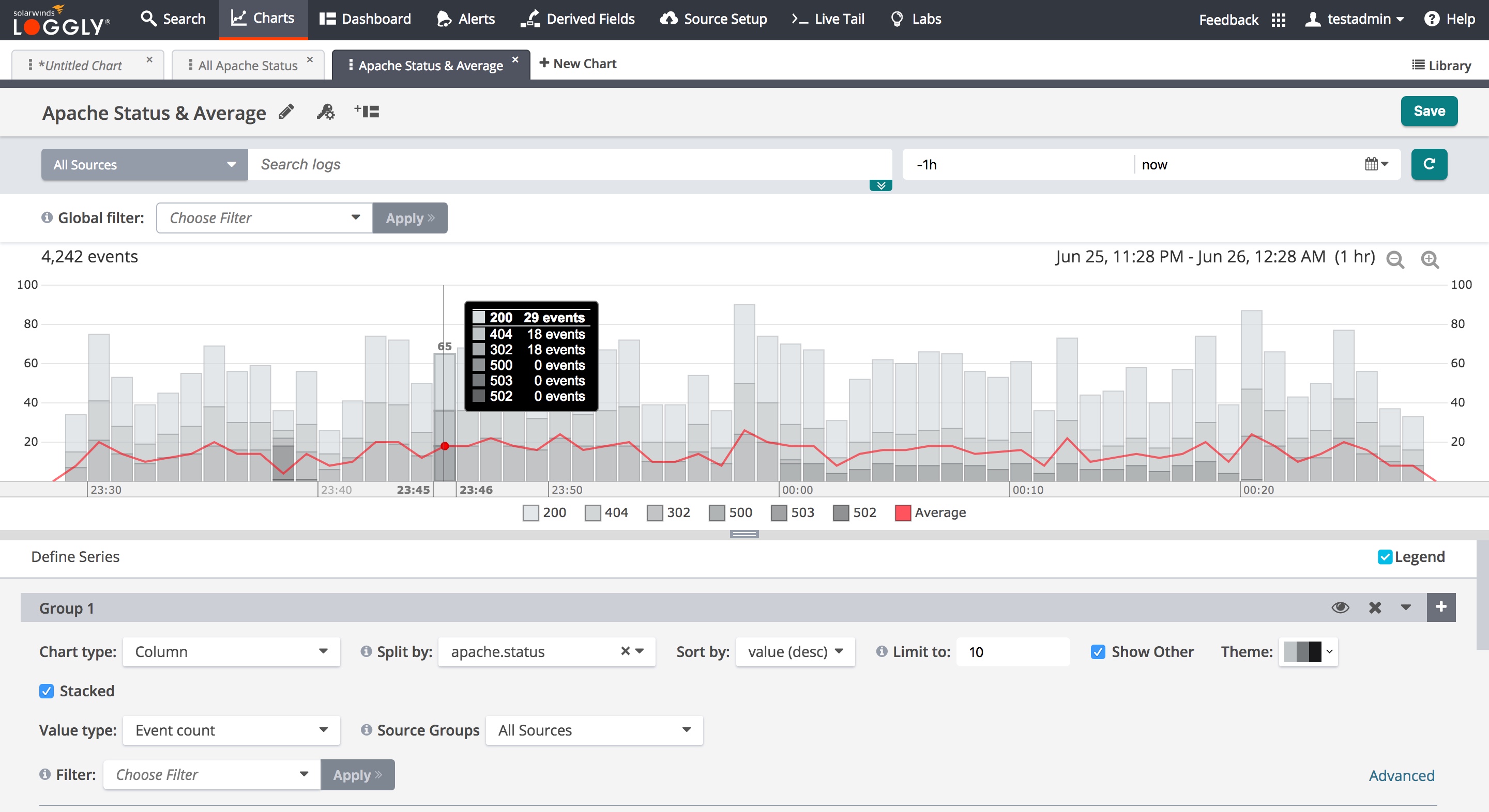
Final design implemented
1.
Video of the Charts & Dashboard feature
Click on the play button to view
2.
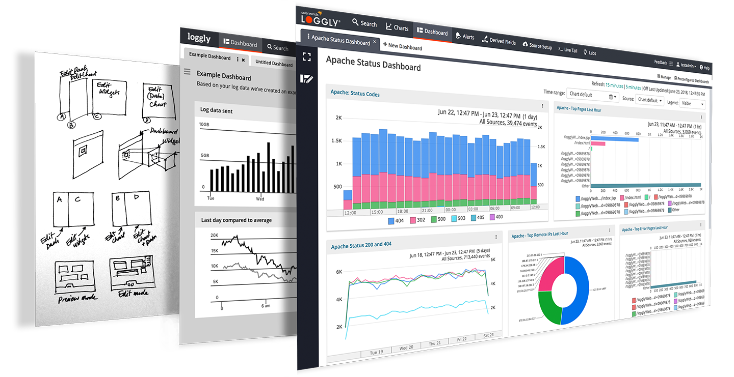
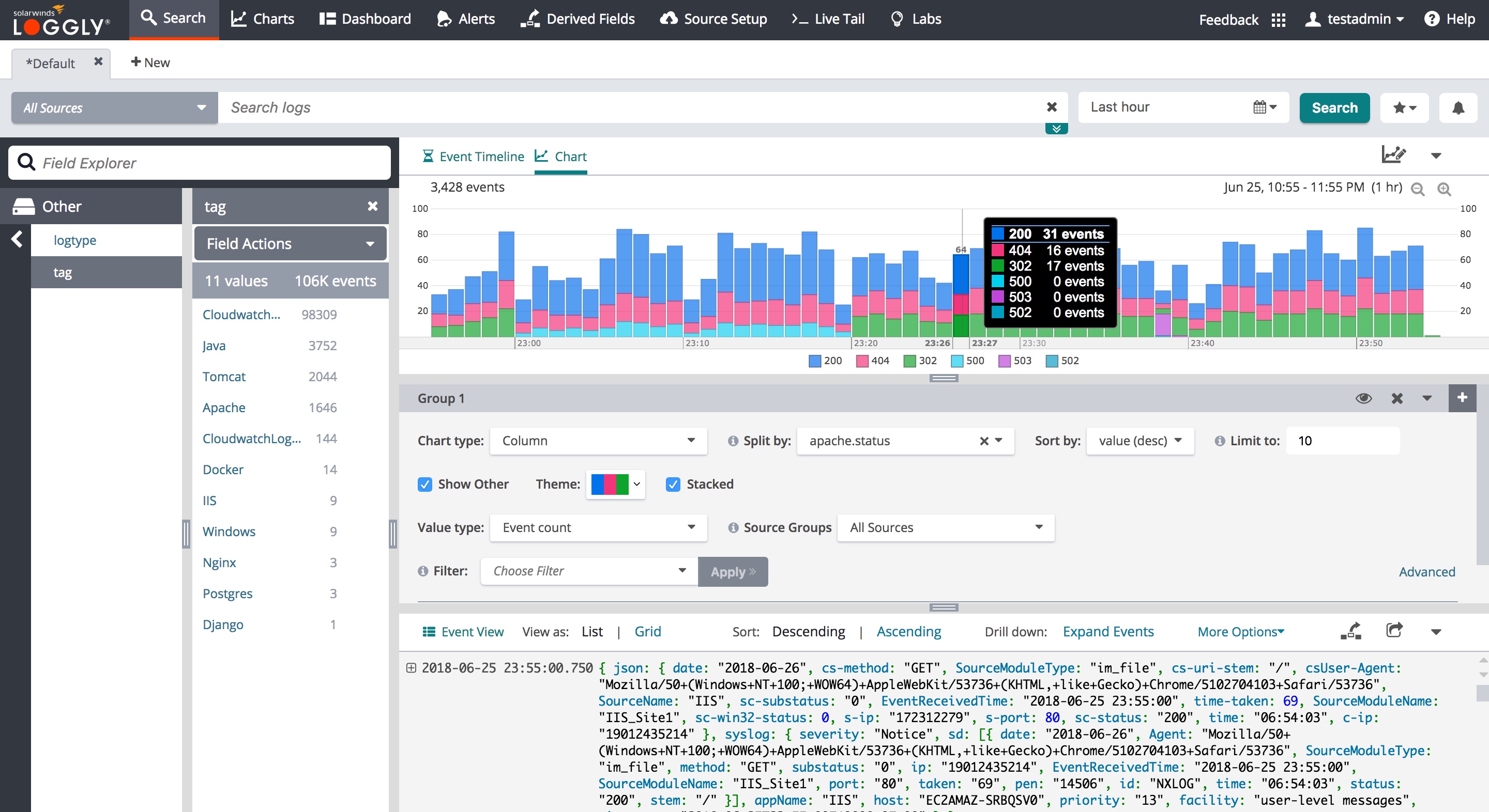
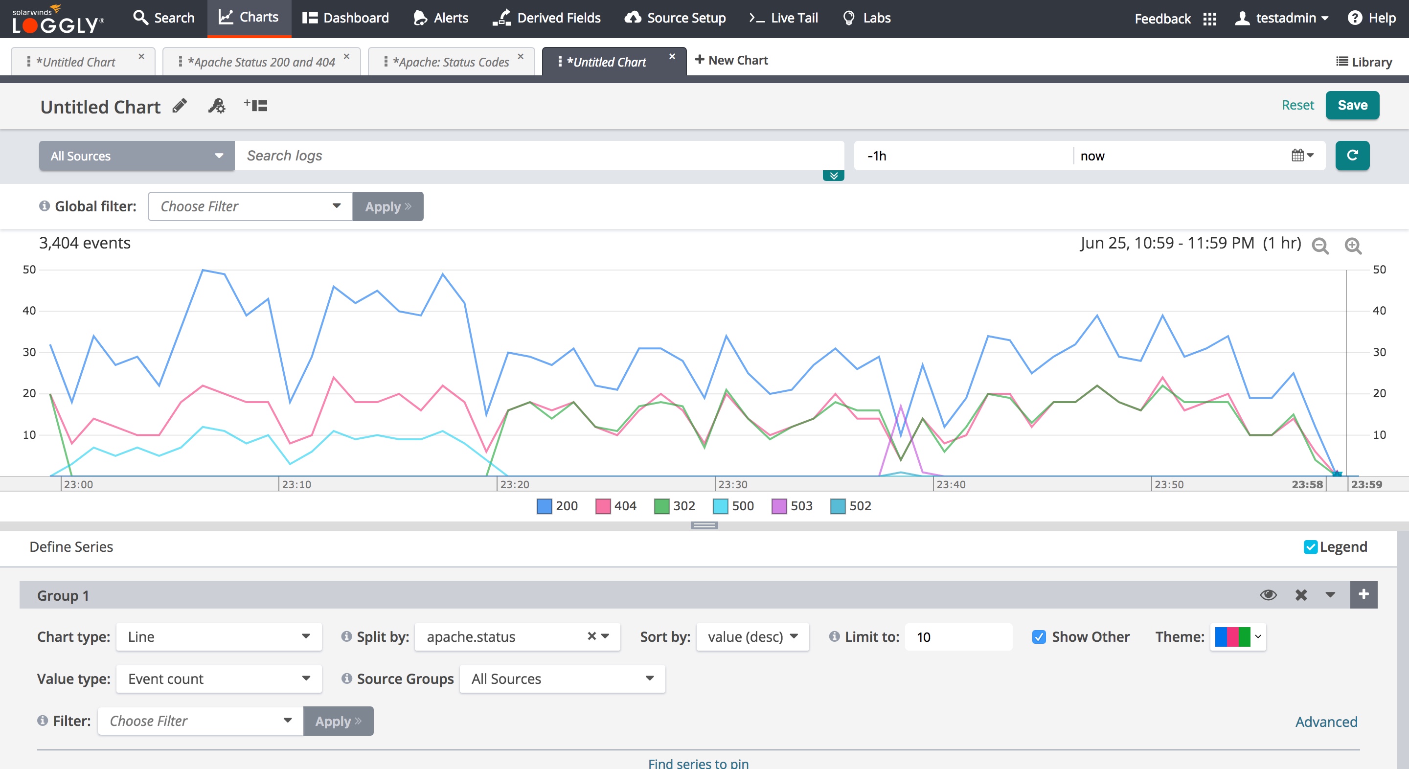
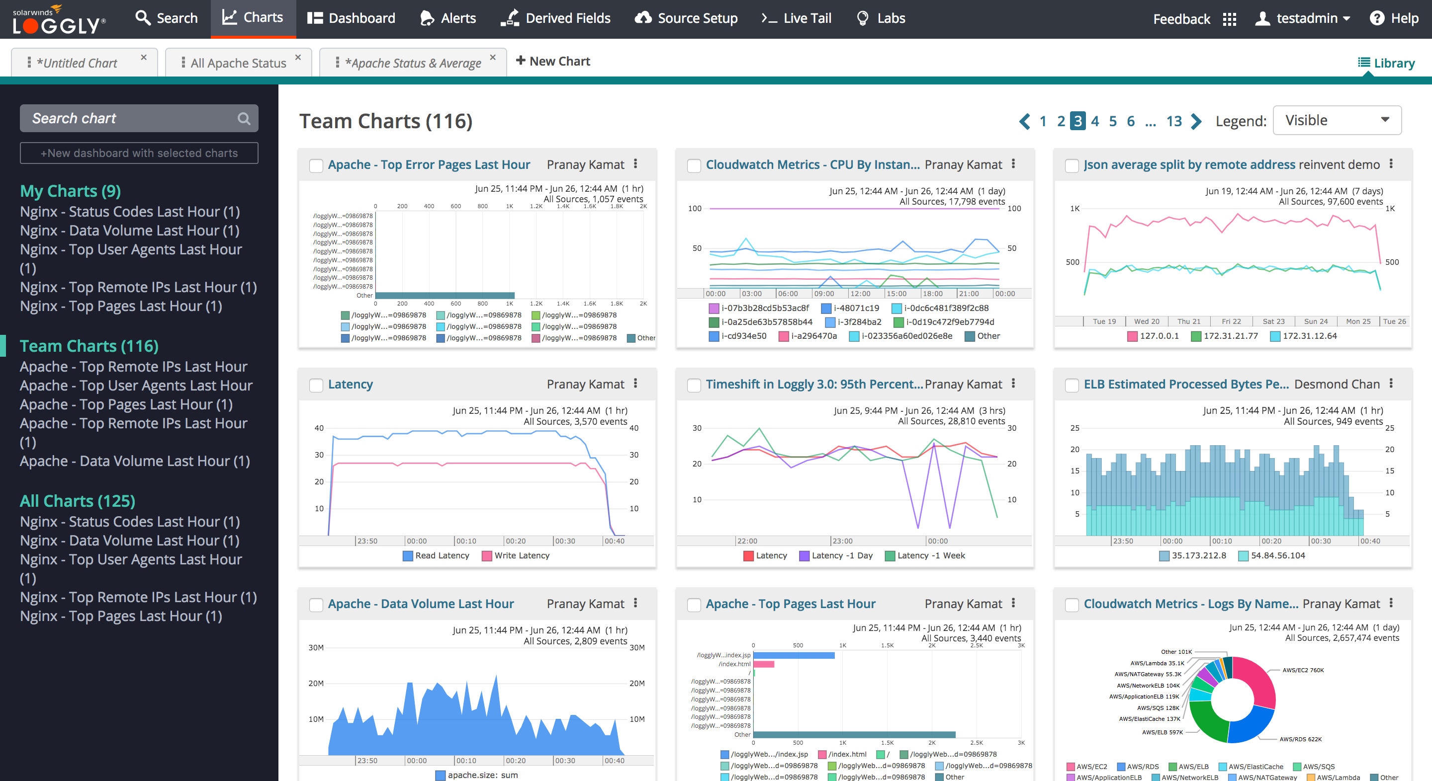
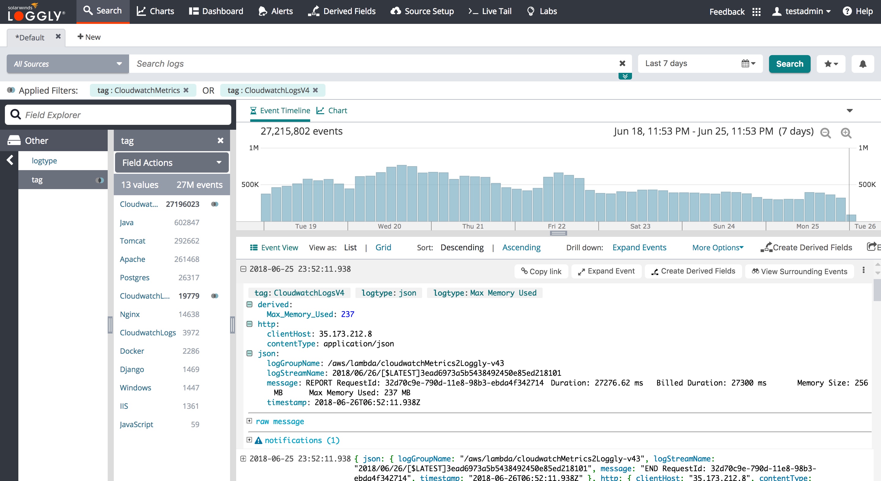
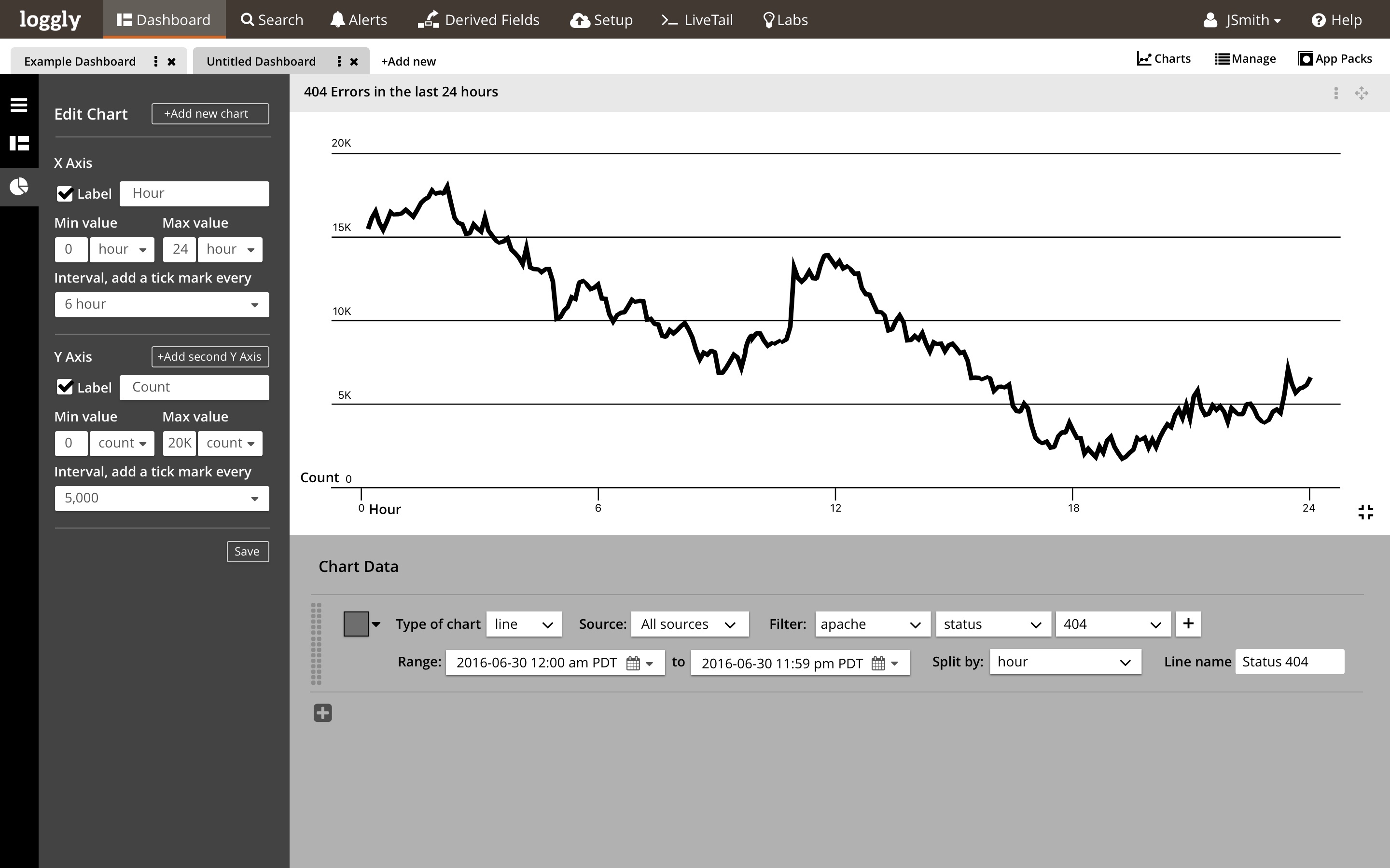
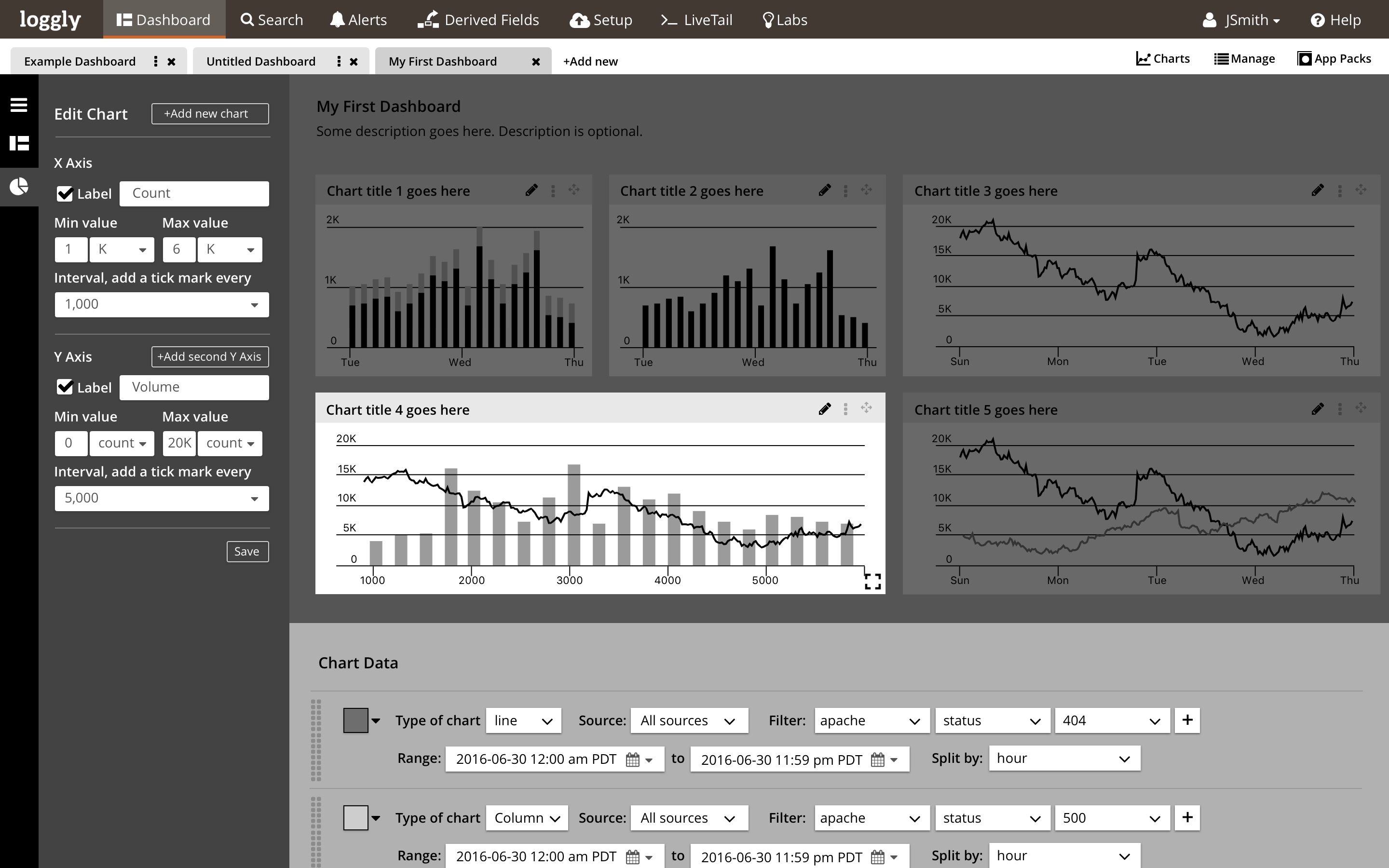
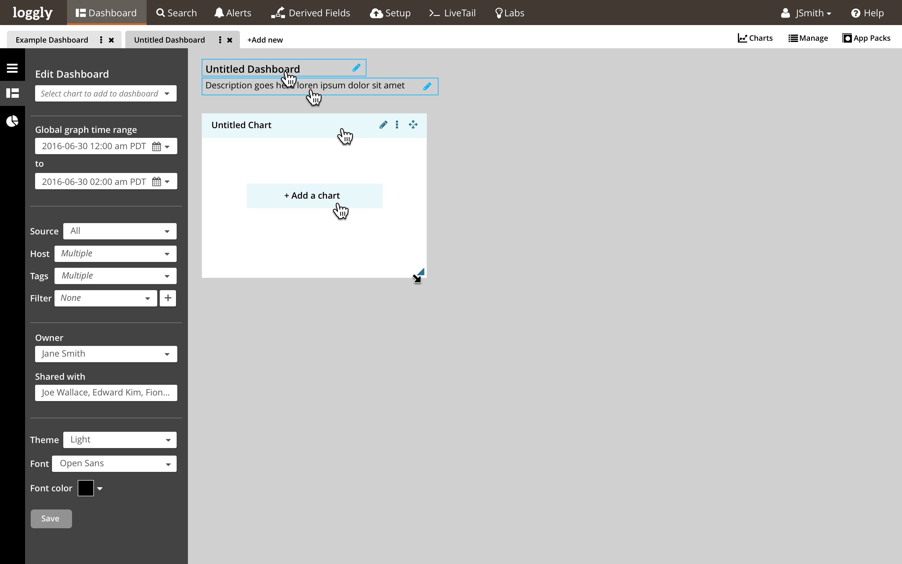
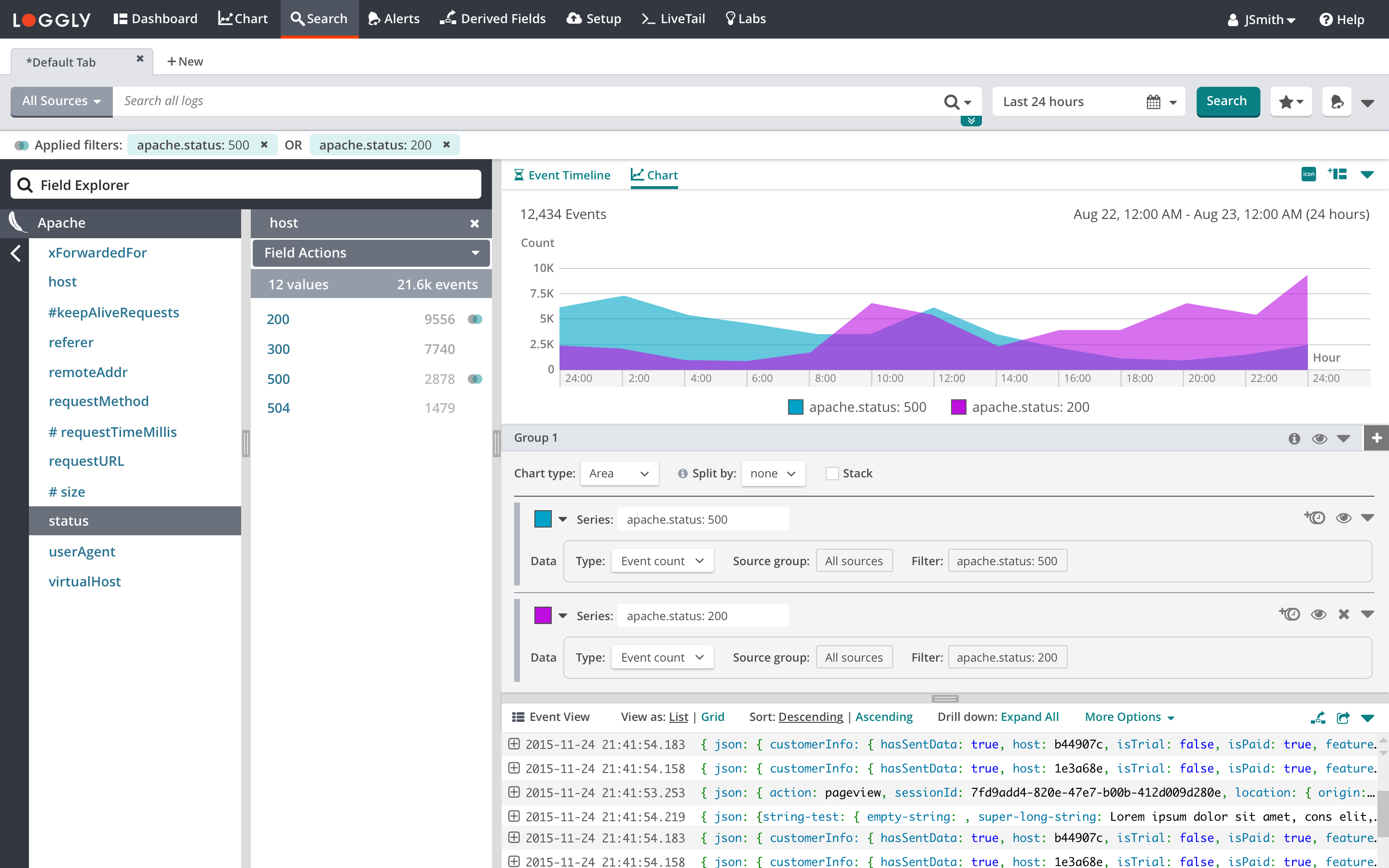
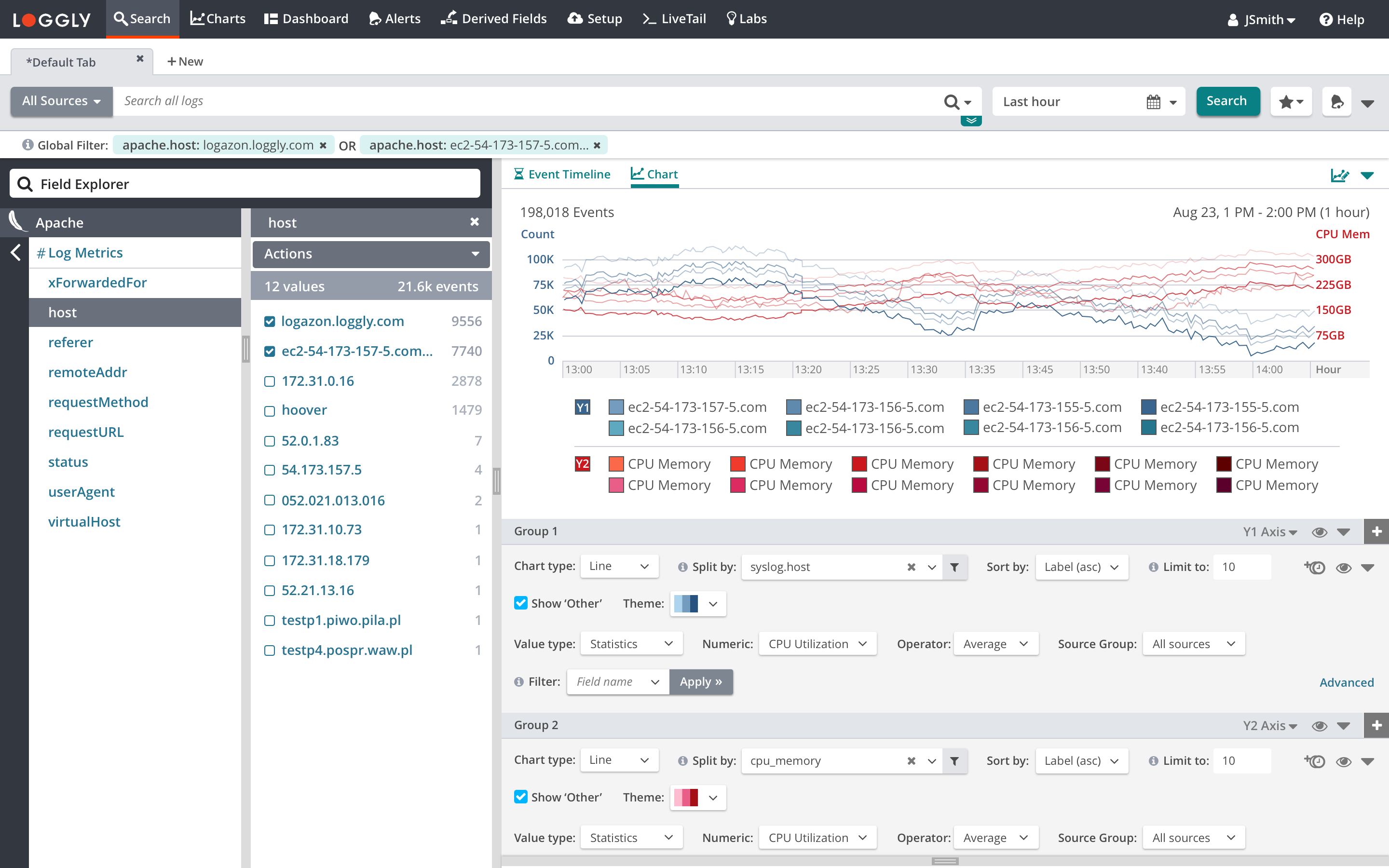
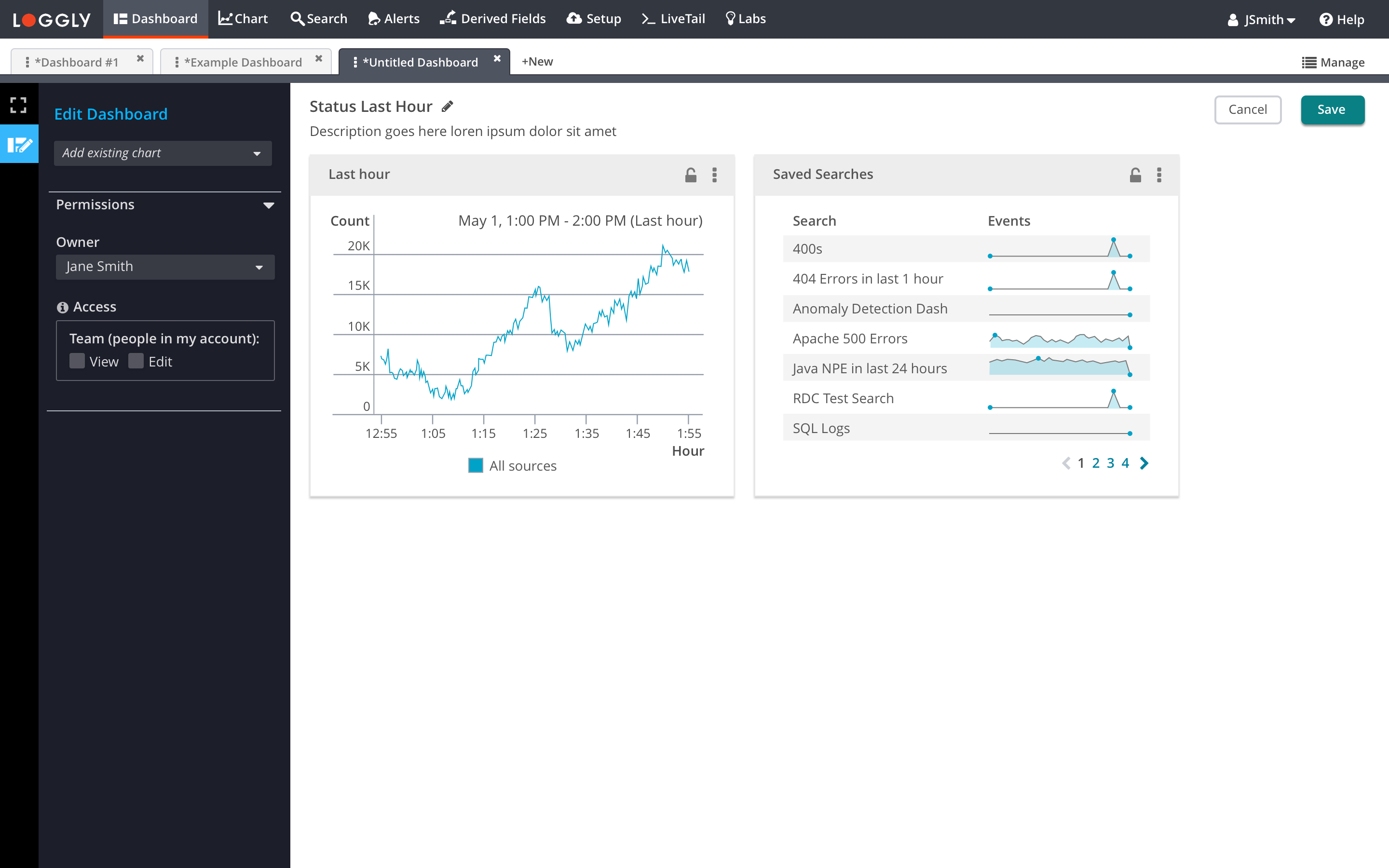
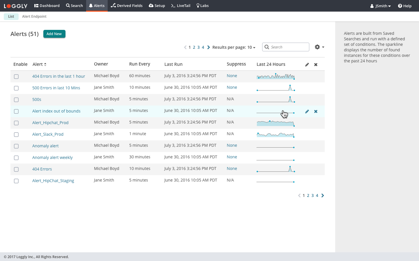
Screenshots from product with final implemented design
Click on left and right arrows or dot navigation to view all screenshots


Design Process
1.
User research, brainstorming, white boarding and concept sketches

2.
Diagrams, workflows and wireframes

3.
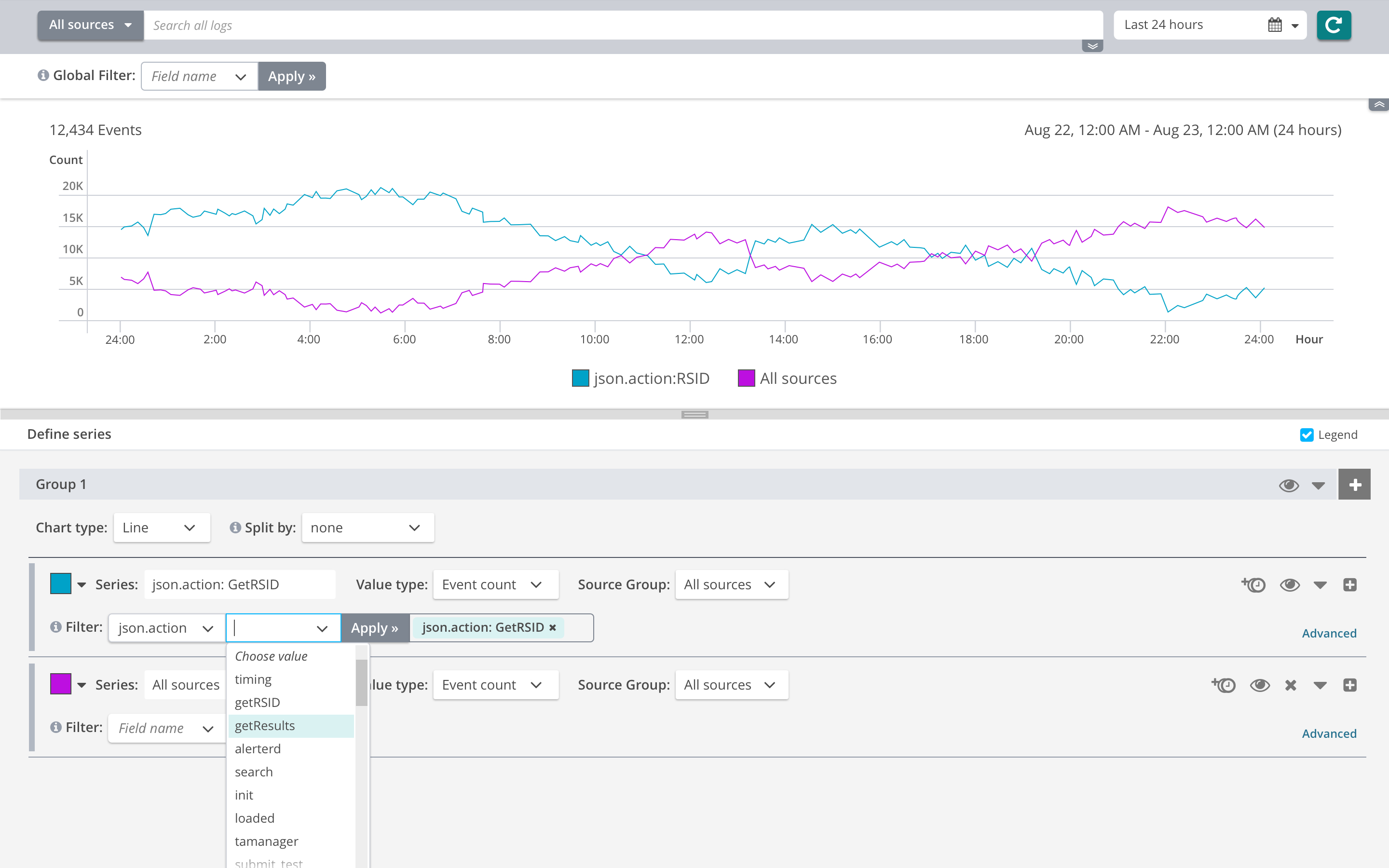
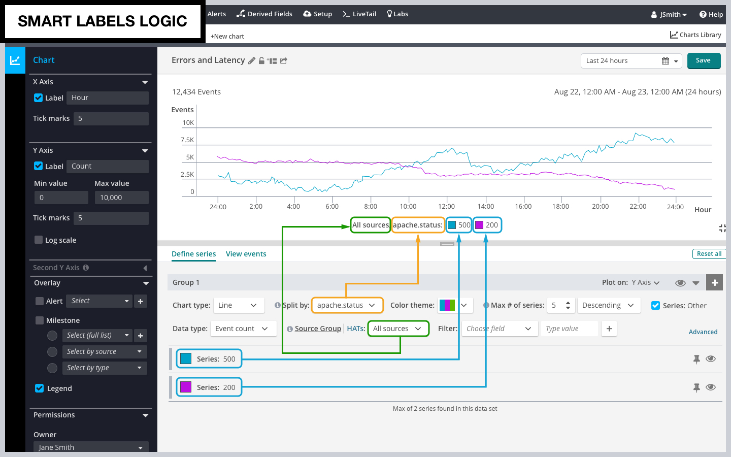
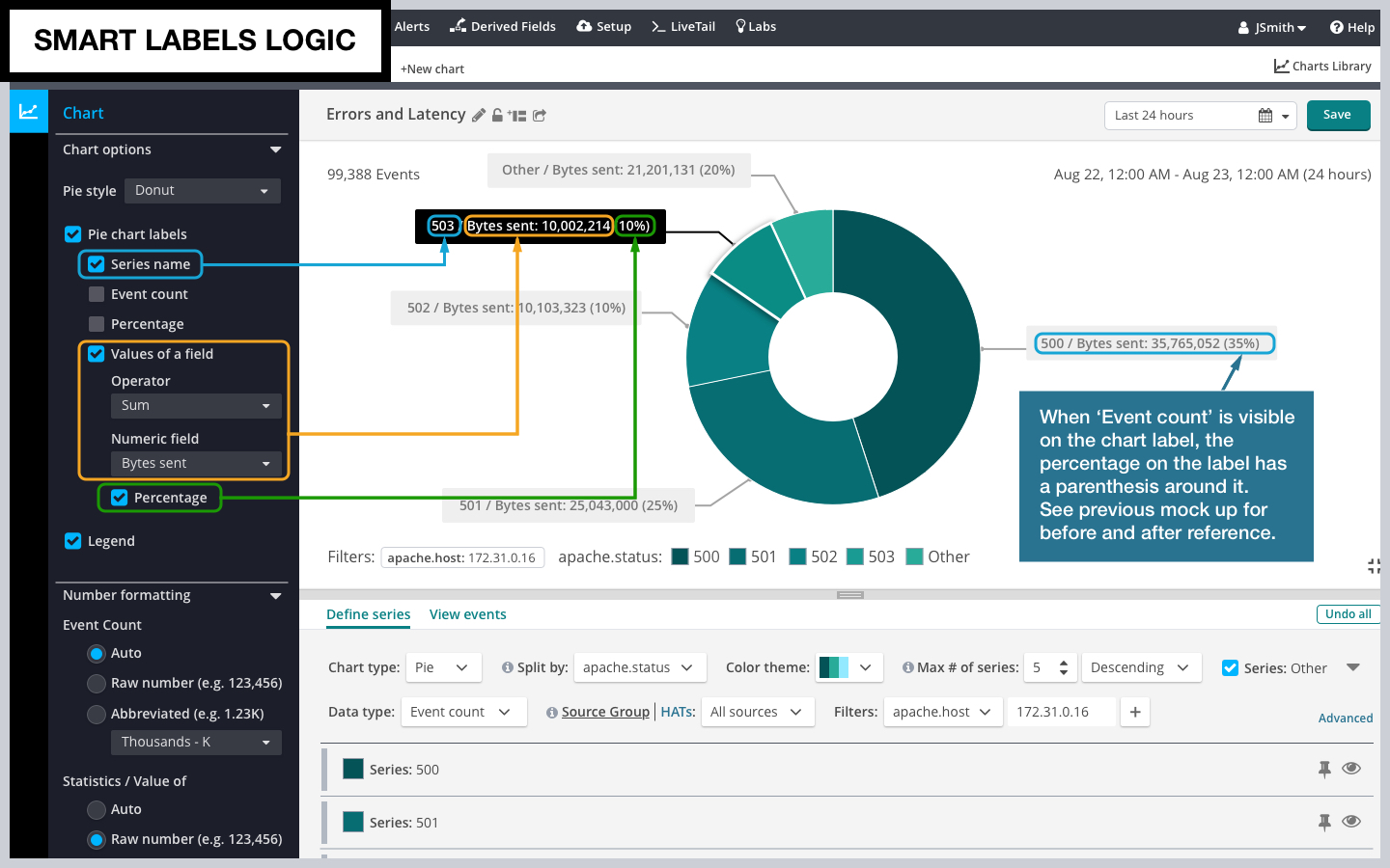
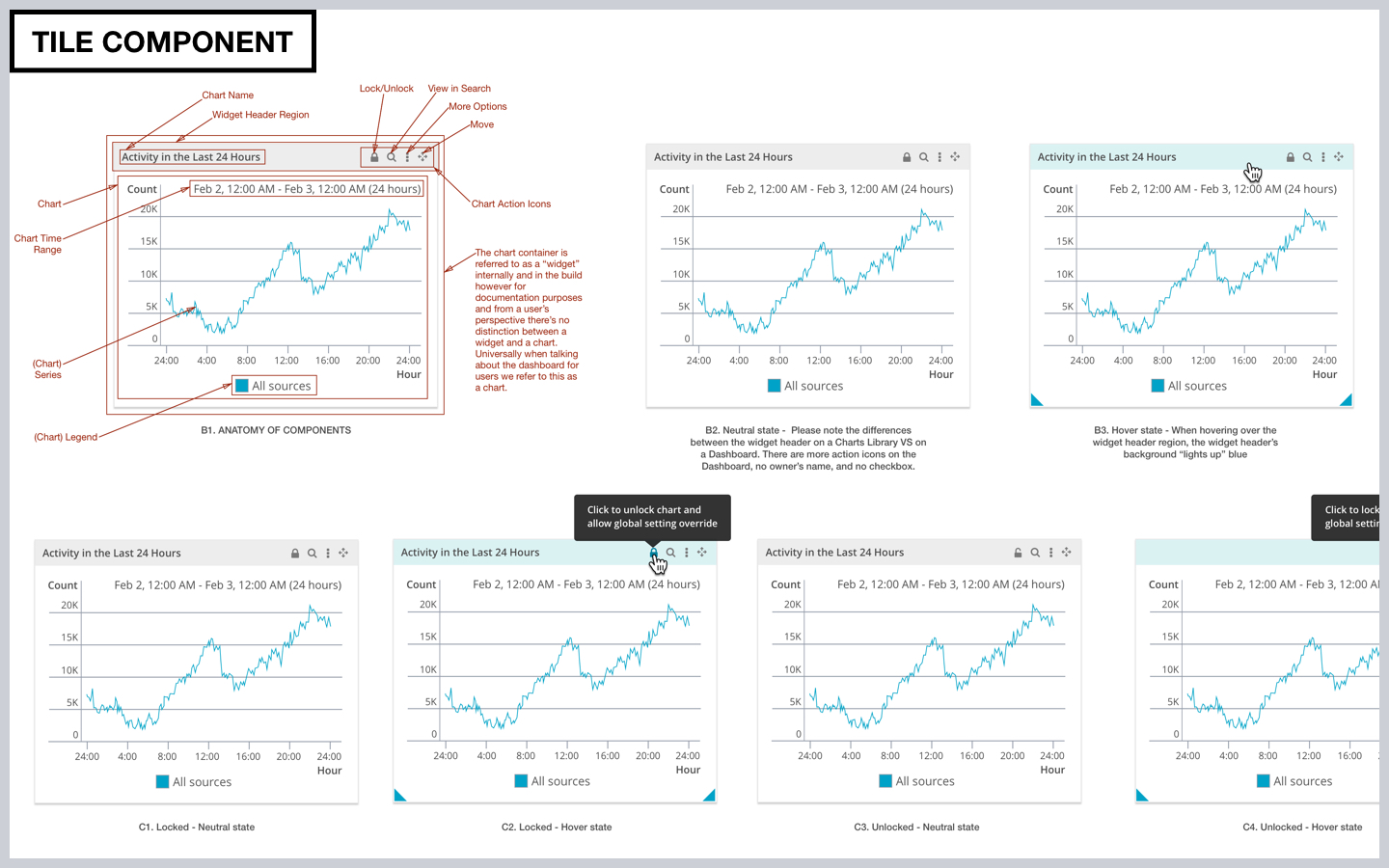
Mock ups
4.
Prototypes
5.
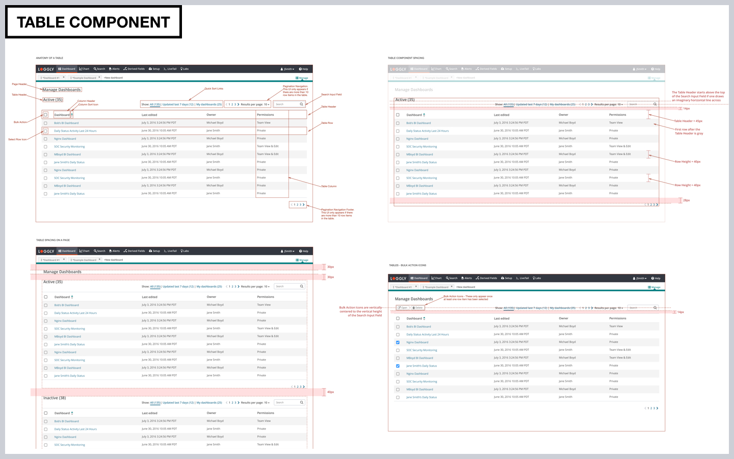
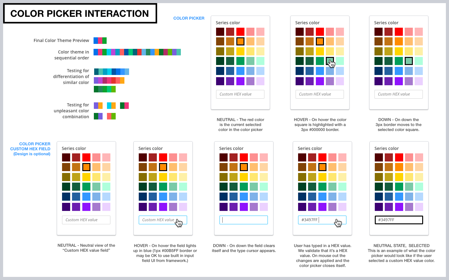
Design documentations
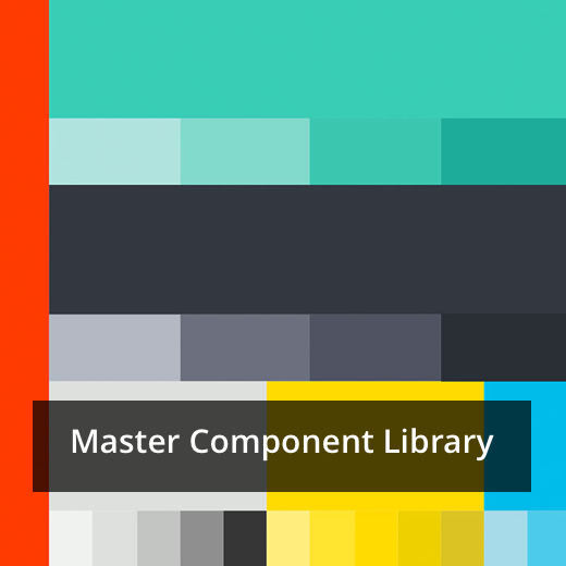
For complete design documentation for this project also see the Master Component Library project
Related Projects