Loggly Master Component Library
2017-2018 / New Loggly 3.0 design and component library
Company: Loggly
Worked on: branding, interaction, visual, & systems design
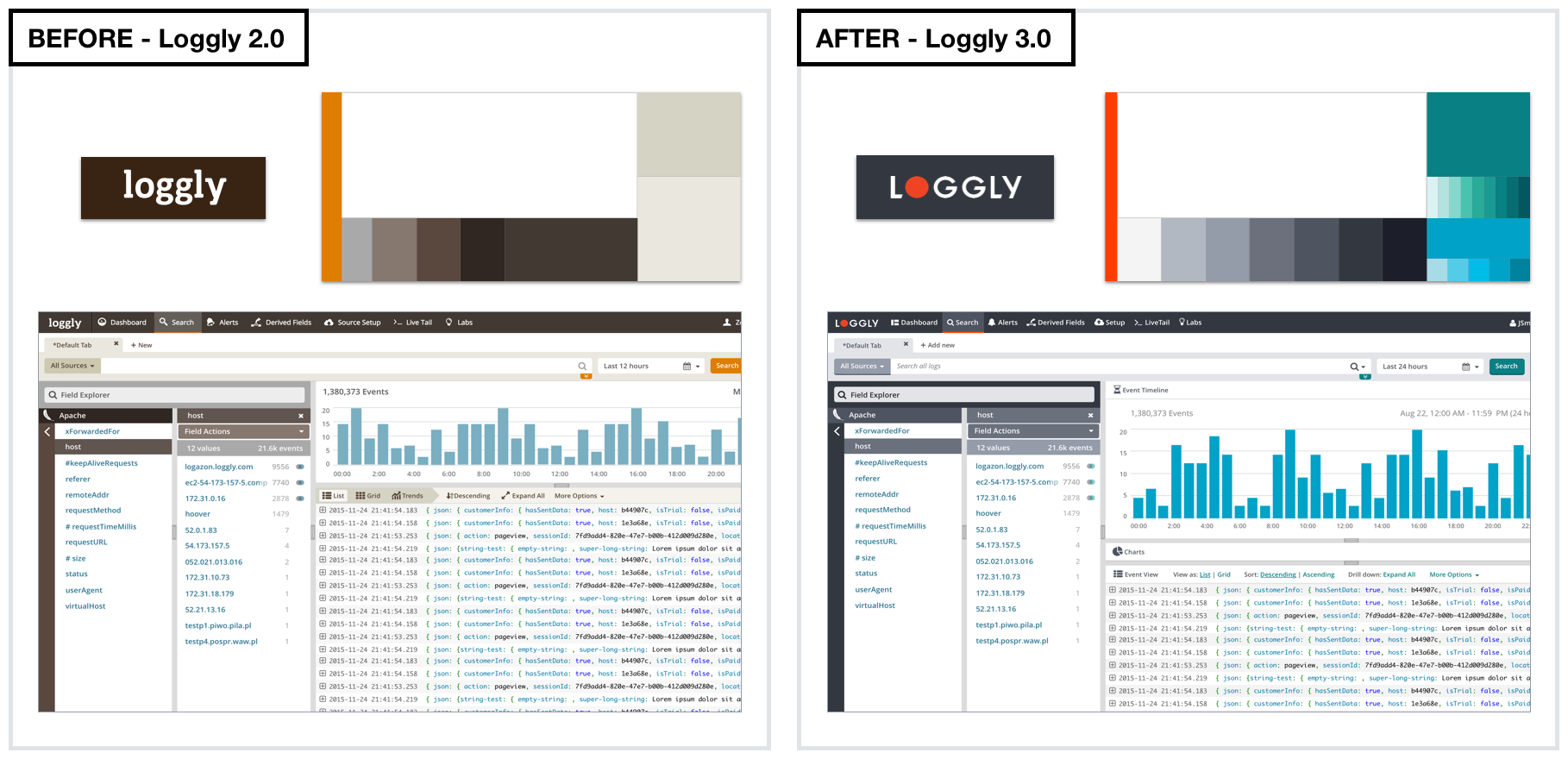
Background: In the fall of 2016, Loggly underwent a rebranding effort. The Loggly logo and brand was completely redesigned. Consequently, the Loggly App needed to be designed in the new brand.
Challenges:
- Expand the Loggly brand visual language to the product
- Design it to be user friendly for app usage while retaining the spirit of the brand guide
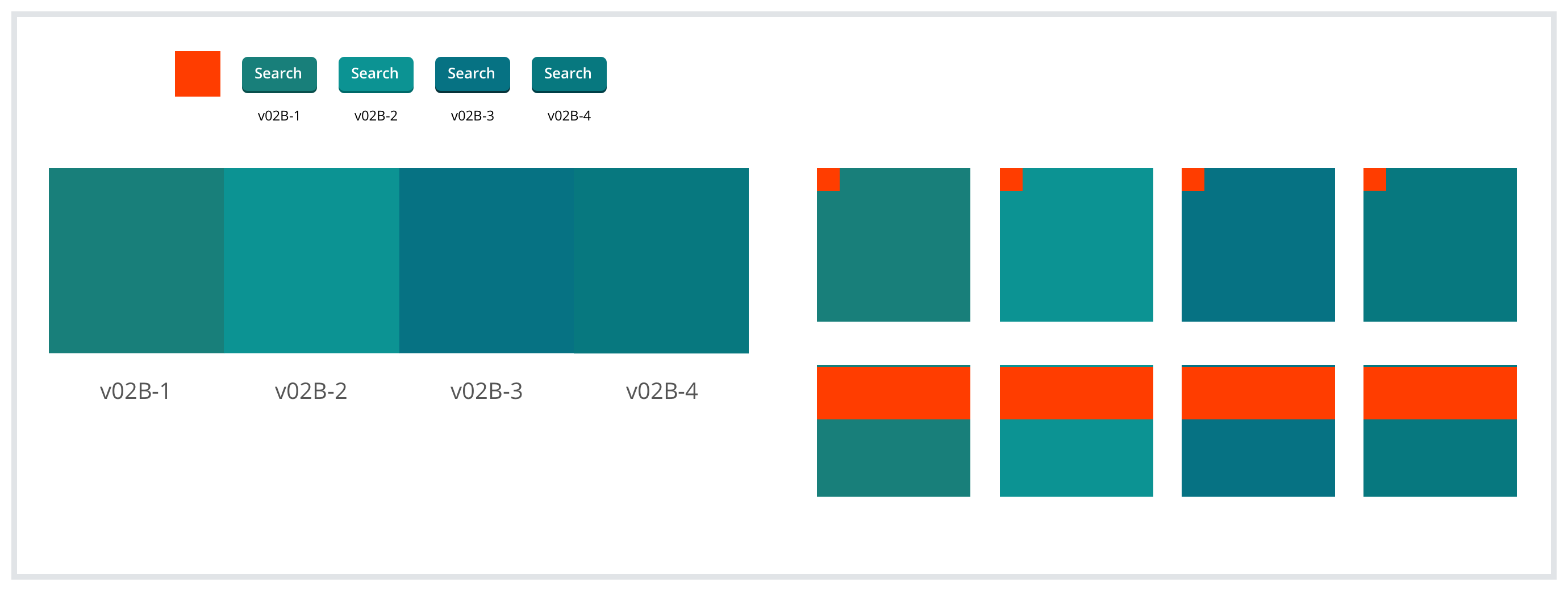
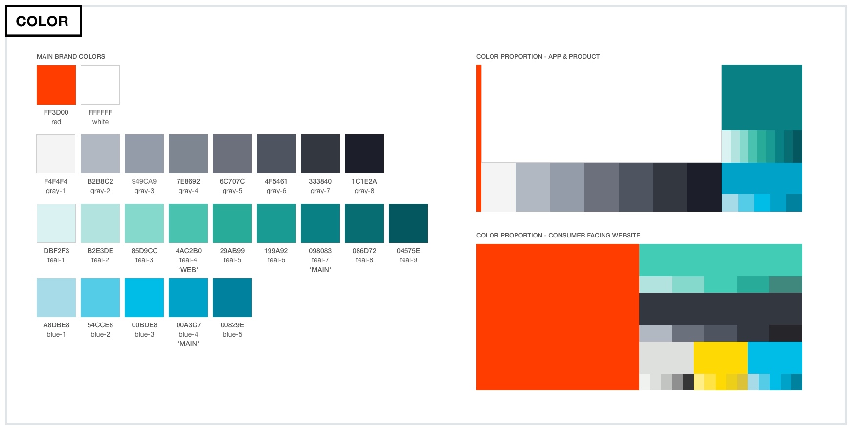
- Color scheme chosen need to meet HCI guidelines and readability contrast ratio
- Design new user interface as a system based on components that can be build using a javascript framework
- Design UI and recommend a path forward for transitioning massive Loggly app from old to new UI with the least disruption for the user technically and visually
- Document design and components as a system that can be handed off and expanded by a future design team
(Click on images to view up close)
Solutions:
- Designed a darker, muted, user-friendly teal that is neither too blue or too green
- Use the teal instead of the red as the primary accent color for the app
- Implemented design rollout done in three stages over the course of several months. First with a minimal impact changing the logo and header only, then just the most trafficked pages, and lastly the rest of the pages
- Audited, deprecated or merged old components with new ones
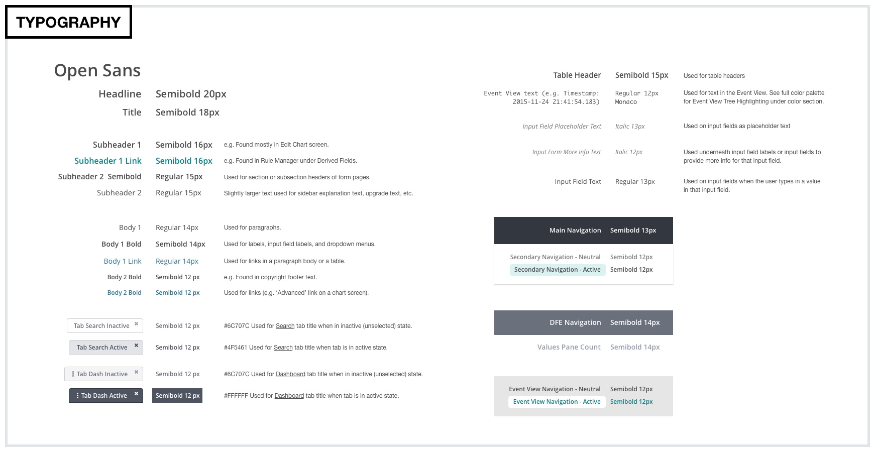
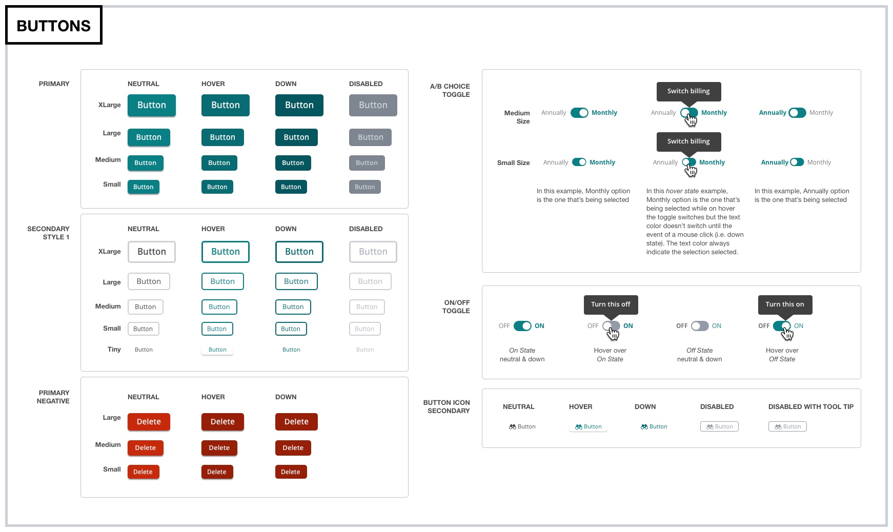
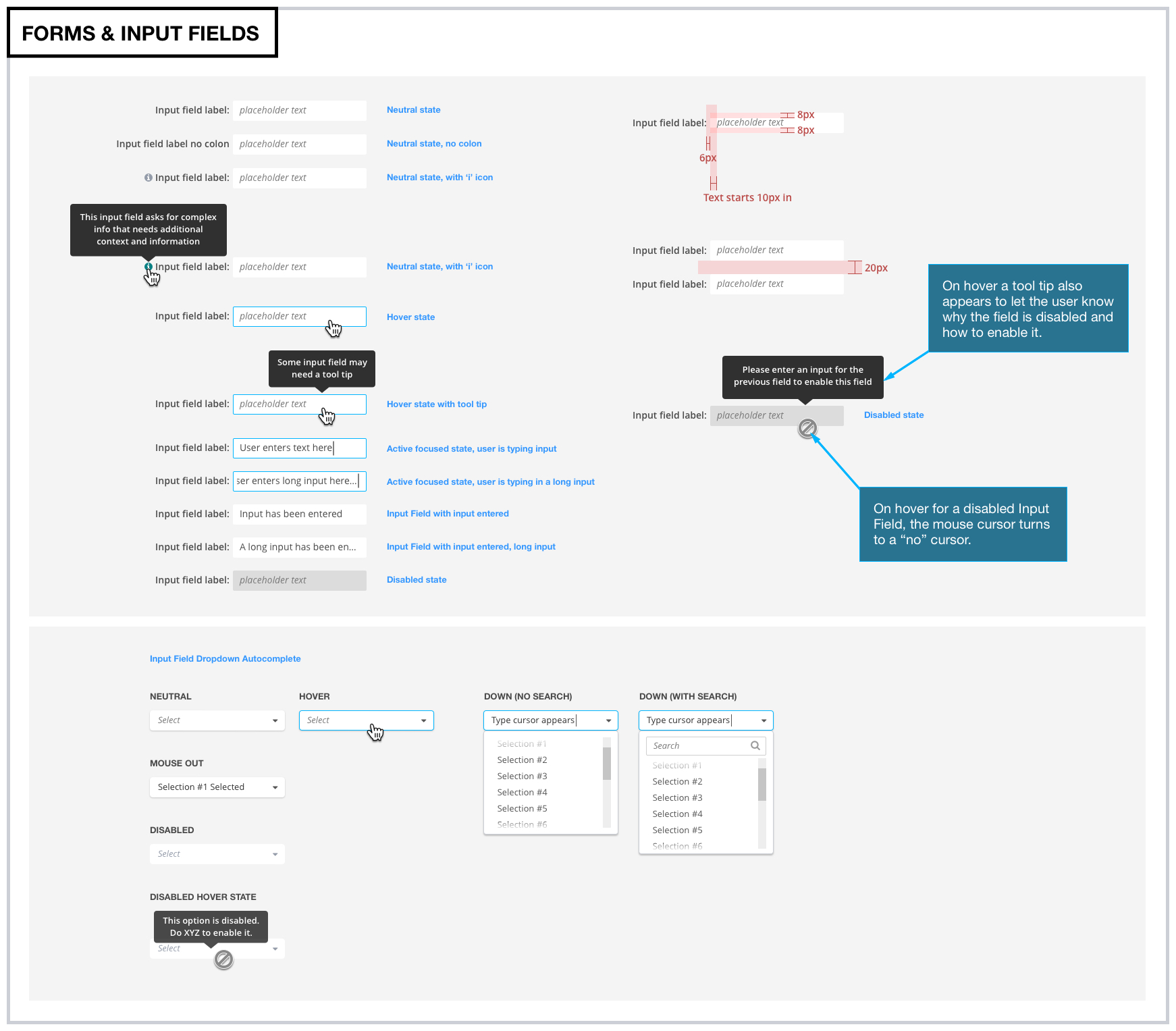
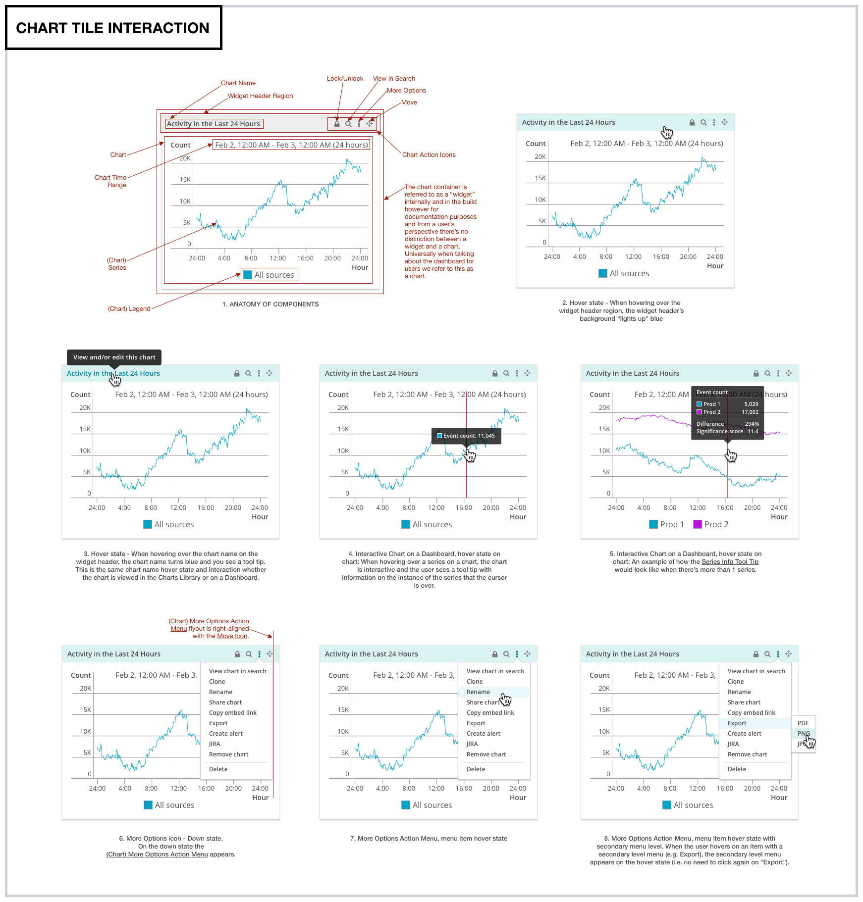
- Originally the need was simply for a newly designed UI in the new brand. At the start of that project it became clear that design documentation would be a big part of this project. Seeing this need, I turned the project into a component library project. A fraction of the hundreds of components in the design documentation are here for preview
(Click on images to view up close)
Related Projects